When you walk through a bookstore (You remember those, don’t your? Physical buildings with shelves of books made of paper organized by genre and author.), how do you decide what book to pick up?
Or, if you’re browsing Amazon or Barnes and Noble, once your search for genre brings up a page of books, what makes you choose to click on a given book?
Answers to those questions vary. For some, it’s the author. For others, it’s the title. But, for a WHOLE LOT OF PEOPLE, it’s the BOOK COVER.
What makes a good cover?
How about a GREAT cover?
Or, if all the ducks line up in a row, A MEMORABLE COVER?
Browse the covers of books in your personal collection.
Is there a theme? If not, what still draws you to those covers?
While I don’t have the ultimate answers to my own questions, I do have ideas to consider if you are publishing your own book.
Design by Publisher’s Service
All self-publishing entities with which I am familiar offer cover design for a fee. Fees start at $200 and range upwards of $500. Some companies offer templates where you use their layout (and their art if you wish) and drop in the title, the author's name, and other text. CreateSpace has several levels of cover design options from generic to full-service.
There are dozens to hundreds of artists willing to design a cover for you… for a price. Do a web search, then check a site and ask for some names to contact.
But, what if you have your own idea?
Self Design
CreateSpace offers a blank template in PDF and .png formats for covers of books published through them. The template is customized for the thickness of the spine. It’s easy to work with, IF, AND IT’S A BIG IF, you have either Photoshop or Adobe Acrobat Pro. I use these templates, and I have both Photoshop and Adobe Acrobat Pro. I would not consider trying to fit my idea/art/text into their template without one of those programs. CreateSpace also offers templates you drop photos into the front and back cover and add your title for free.
Evolution of the Covers of Traveler’s HOT L – The Time Traveler’s Resort and Insecticide-A Science Fiction Thriller
During the course of my high school and university teaching, I’ve had several fine artists as students. For Traveler’s HOT L, I was VERY fortunate to have Reed Steiner, now a Graphic Arts teacher, who was willing to work with Koehler Books on a cover design.
The photo that follows is one set of pencil sketches Reed submitted.
From that group, the publisher, with input from me, selected the lower right option to enhance. The next photo shows the intermediate design, also a pencil sketch.
If you compare this to the final cover, you will see how someone who knows what he/she’s doing can make what I think is a memorable cover.
INSECTICIDE'S cover has a similar path from a different origin. This artist is one of my students from Great Oak High. I’d seen her work when she was in my class, and I asked if she was interested in helping. She graciously accepted.
The story begins with a planet being split by a meteorite. Here’s her first idea.
Very cool, but it’s not true to the story. So I sent her the following.
Once we settled on the art for the cover, I added the title, my name, and the name of the character she represents to the front. I used Photoshop and added more of her art to the back cover. Check out the final cover on Amazon to see, once again, what an artist can do with minimal inspiration! I consider this my tribute cover to the sci-fi author’s and illustrators from the Golden Age of Science Fiction (1940s-1960s)—my favorite time for that genre!
I've done some covers from scratch by myself. I have two former students whose eye for covers are quite good. Here are photos of the evolution of two covers with which they have assisted.
First. The 5th Page is now Betrayal in Blue.
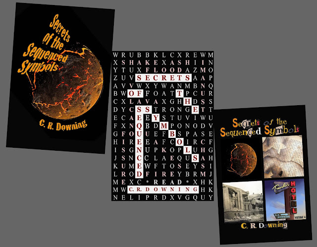
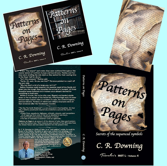
Second. Patterns on Pages.
I uncharacteristically deleted most the covers with the original name, Secrets of the Sequenced Symbols. Here are three of the "early editions."
After the name change to Patterns on Pages, there were fewer candidates. The full cover on the bottom is the cover as printed in CreastSpace and Kindle.
Next: Authors. Closing the Cover


No comments:
Post a Comment