Tuesday, January 30, 2018

Authors. Closing the Cover - UPDATED


In my last blog, described the process I followed for the cover evolution for three books I' had published. In this blog we’ll look at three elements of book cover selection: 
1) Book under contract; 
2) All books in a series;
3) The cover is just plain wrong.

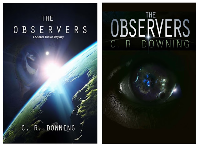
If you are looking for a contract with an established publisher, you probably won’t have the option of auditioning an artist or an idea for your cover. You might, but the odds are not in favor of those options. My second book with Koehlerbooks, The Observers – A Science Fiction Odyssey, will be released December 2014. Koehlerbooks has a unique approach to many of their covers—they offer two options and visitors to their website can vote on the option they like the best.


Books Under Contract
Left Cover. Very sci-fi. Use of sun illuminating planet and eyeball is dramatic. Eyecatching. Right Cover. Eerie/Ominus. Iris of the eye contains or is reflecting a solar system. Very dark. Still has solar flash on iris.

I liked the one on the right a lot, but the original had eyelashes--see photo above, something the characters did not have. Who knows if a bit more contrast and no eyelashes from the get-go and . . . 

Here’s the result of the vote for The Observers. And the winner is…


I think potential readers did a fine job. The cover captures the essence of the book without giving away anything significant in the plot. It also includes the visual drama of the faded alien eye (observing!) with the flash of an unknown sun as it rises over the horizon of an unnamed planet.

To close this part of the discussion, a New York Times Best Selling friend of mine under contract with a large publishing house was shown two version of the same cover art for each of her books. She was asked for her opinion, but it was worth only one vote.


All Books in a Series

Chances are good that if you don't already have an idea for a series of stories, you will have a series in mind at some point. What do you do about the covers for books in a series?

Since I've already set up the idea of a triad in this post, here are three options for book covers in a series. There is always the option of a different cover for each book in the series. I'm not going to spend time on that option because individual book covers are discussed in part 1.
A common cover for each book in the series--only the title is different.
While this isn't common, some authors use this choice. There is no doubt in a reader's mind if a given book is part of a series.

A theme--similar layout and "feel"--for all covers in the series.
This choice may be the most common marketing ploy. 

A common element only for all books in the series. This can be overt.
This is the cover for the boxed set of this series. The common elements in each of the four separate titles are obvious.
Other authors choose subtle, almost subliminal commonalities.
The author's name is prominent and consistently placed. There is a single symbol separating the author's name and the title in each. The most dramatic difference is the formatting of the "art" on the cover. These examples are less obvious, but there is a tagline on each noting its inclusion in the series.
In both cases, the idea of a book series is evident.

I have two series in some level of production. Mamba Mysteries are the stories featuring my private detective, Phil Mamba. My original thought for series integrity in the covers was to go black and white with the same detective silhouette in each. The books are set in the 1980s-90s, and Phil considers himself old-school in my ways.
Okay, but hardly compelling. So, I tried logos.
The MM logo was more of a publisher's imprint. When I get around to it, I'll add the silhouette logo to the Mixer Murder cover. It's already on Betrayal in Blue's current cover version.

My signature series is Traveler's HOT L. Below are the covers of the first four books in the series.


My intent was to have some version of the retro sign on each cover. I even made a logo. Dumb idea.


I decided to hybridize series cover ideas. Look closely at each Traveler's HOT L book cover. What's the common element?
(Answer at the end of this post.)

The cover is just plain wrong
I doubt if anyone wants to admit to making a major error on the cover of their book. I suspect it happens more often than you think. 

Here's an idea for a book cover that's just bad. It's one of mine that will never be seen outside this blog. 
Four pages of names and one page with California DMV information. Five pages total. Never even got the name of the book on this idea.
Thank goodness!
When a cover idea is bad, kill it!

I stumbled upon this blog 8 cover design secrets publishers use to manipulate readers into buying books. It gives excellent hints and examples of strong cover design.


Traveler's HOT L series common cover item.
Original Traveler's HOT L title fonts and the volume number are on all volumes subsequent to the original.
Next Blog: It Takes a Strong Back and Spine To Be a Winning Cover - UPDATED - Final blog in this series on book covers
Follow me on Twitter: @CRDowningAuthor and Facebook: https://www.facebook.com/CRDowningAuthor

Monday, January 22, 2018

#Anthropology #Kumeyaay Where I live was under the sea! Part 2 - "On the Estuary" a tale of life on tidelands

If you took the challenge in last week's post and tried to identify the artifacts, the answers are at the end of this post. If you didn't do that yet, there's still time. Here's the link to Where I live was under the sea! Part 1


On the Estuary
By C.R. Downing. ©2018

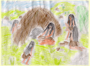
The Mother bent down and gently puffed her breath toward the dry cattail leaves. She was trying to start a fire. A tiny spark from her prized flint glowed on the dry leaves. If she was careful, she would cook dinner tonight.

She paused, and then she blew softly again.

A tiny flame licked hungrily at the dry fibers.

With the same gentleness she used with her babies, the Mother placed two twigs on the flame. Within seconds, she had a true fire. 

Over the next several minutes, the Mother added small pieces of precious wood to her cooking fire. Only once did she have to stop and call her children back to their task of searching for evidence of clams on the sticky mud of the low-tide estuary. She hoped the Father would arrive soon with some fish or game for dinner.

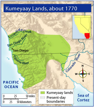
Her people, the Kumeyaay, were strong and proud. Their clans controlled all the area from what is now Escondido, California to the North to far below what is now Ensenada, Mexico to the South. The Eastern border extended to what is now known as the Colorado River. Only the Pacific Ocean to the West blocked her people’s expansion in that direction.

   Overall, the Mother’s life was good. Her clan lived in what is now the Point Loma area of San Diego, California. She and her husband had three children. The family lived along the tidal flats in a willow-framed structure covered by brush.

   Many in her clan used boats made of bundled reeds and coated with tar as waterproofing. The shells that they collected and sometimes made into jewelry were traded far beyond her nation’s boundaries.
   This late afternoon, as the sun prepared to drop into the sea, putting out its fiery light and bringing another night for rest to the Kumeyaay, the Mother looked off to the high ground that was never covered by the ocean’s tides. It was there the family last saw the Father as he began to hunt before the sun was high in the sky.

   She turned toward a sudden shout from down the mudflat beach. Her children were running towards a figure striding purposefully toward her fire.

   The Mother stood and smiled. It was the Father, and he was carrying a pelican!

   Working quickly to take advantage of the dying sunlight, she plucked and gutted the bird. She stuffed some kelp blades into the body cavity, pushed a cooking stick through the body from tail to neck, and propped the stick so the pelican rested just enough above the now glowing embers to cook. She was careful that their meal was not so close that it would catch fire as the fat dripped down on the coals.

   Calling her youngest daughter, she instructed the girl to turn the stick so the featherless skin would brown on all sides. She watched as the girl performed her task once, then she gave her daughter a smile and a soft touch of recognition for a job well done. She wrapped two seagull eggs in kelp blades and placed the kelp-wrapped eggs in the embers. These the family would share along with the meat.

   When both the bird and bird eggs were cooked to her satisfaction, the Mother called the Father and her children to the fire. Using her flint knife, a luxury she enjoyed thanks to the Father’s skill at bargaining shells for needed items, she cut the bird into five chunks of varying size.

   She handed the Father the largest piece. She placed one of the kelp blades in a basket, placed one egg on the brown kelp blade, and cut the egg in half. She slid one half of the egg onto another kelp leaf and left the other half on the first blade. She handed the Father his kelp blade and half of the first egg and put the blade with her half near the embers.

   The Father smiled as he chewed his egg. He enjoyed these times with his family.

   The Mother looked up, saw her husband’s smile, and returned it. After warning the children to be careful with the hot food, she cut the second egg into three equal size pieces and handed them out.

   The members of the Kumeyaay family were in no hurry. Each gnawed the meat off the bones in their share of the pelican. The Mother collected the bones and cut them in half with the flint knife and handed them back to her family. They knew the value of the marrow they sucked from those bones. Each was careful to remove as much as they could before the tossed the light, white cylinders into the sand next to the fire.

   “The tide returns,” were the simple words spoken by the Father. It was time to move to their shelter above the tidal line.

   Bones, feathers, pieces of eggshells, and other leftovers were scattered around what was left of their fire. As the embers died, the Mother sent a prayer of thanks to the red-tailed hawk that glided overhead. She knew the hawk would carry her message to the high god.

   Calling her children to follow them, the Mother and the Father led the way to their shelter.

   The tide rose, carrying with it a slurry of sandy mud that mixed with runoff from a rainstorm in the mountains that found its way to the estuary. The combination of clay and silt settled in the darkness, covering the embers, bones, and shells. When the morning low tide exposed their dining area of the night before, no one in the family could have found it, even if wanted to.
The Family's Cooking Fire After Dinner

Our story of the Kumeyaay family ends here. However, even though the family could not find their dining area, I found it. At least I found someone’s cooking site.

I estimate that these artifacts are at least 450 years old. I dug them up when I installed my pond in the Loma Portal area of San Diego. The total height of the bank in my yard from the top to where the pond is and the artifacts were found is 45 feet. Assuming the artifacts are 450 years old, approximately one inch of new clay and silt and shells would have been deposited on top of the cooking site every ten years on average.

Eventually, the ocean receded from the area. The deep layers of clay hardened. Only after the clay bank had been cut and houses had been built in Loma Portal in 1960 was the cooking site close enough to the new surface that it could be easily dug up.

Answers to what's in the sand/clay I dug up. 
I made a Powerpoint on the Kumeyaay for the teachers to use with the artifacts.
Here's the link to that presentation.

SEO: California history, Native American family life

Follow me on 
Twitter: @CRDowningAuthor

My website is: www.crdowning.com

My Blogs
Life as I see itTopics rotate between those of general interest to lovers of life,  authors, teachers—probably you, too.  Posts on Tuesdays and some Mondays.  http://crdowning-author.blogspot.com/?alt=rss

My Christian Context. Posts M/W of discussion questions. Thursdays - Timeless Truths. Fridays - Expressions of Faith. https://mychristiancontext.blogspot.com/  

I appreciate your feedback on Blogger!

Tuesday, January 16, 2018

Authors. You can’t tell a book by its cover, but . . . UPDATED


When you walk through a bookstore (You remember those, don’t your? Physical buildings with shelves of books made of paper organized by genre and author.), how do you decide what book to pick up?
Or, if you’re browsing Amazon or Barnes and Noble, once your search for genre brings up a page of books, what makes you choose to click on a given book?

Answers to those questions vary. For some, it’s the author. For others, it’s the title. But, for a WHOLE LOT OF PEOPLE, it’s the BOOK COVER.

What makes a good cover? 
How about a GREAT cover? 
Or, if all the ducks line up in a row, A MEMORABLE COVER?

Browse the covers of books in your personal collection. 
Is there a theme? If not, what still draws you to those covers?

While I don’t have the ultimate answers to my own questions, I do have ideas to consider if you are publishing your own book.

Design by Publisher’s Service
All self-publishing entities with which I am familiar offer cover design for a fee. Fees start at $200 and range upwards of $500. Some companies offer templates where you use their layout (and their art if you wish) and drop in the title, the author's name, and other text. CreateSpace has several levels of cover design options from generic to full-service.

There are dozens to hundreds of artists willing to design a cover for you… for a price. Do a web search, then check a site and ask for some names to contact.

But, what if you have your own idea?

Self Design
CreateSpace offers a blank template in PDF and .png formats for covers of books published through them. The template is customized for the thickness of the spine. It’s easy to work with, IF, AND IT’S A BIG IF, you have either Photoshop or Adobe Acrobat Pro. I use these templates, and I have both Photoshop and Adobe Acrobat Pro. I would not consider trying to fit my idea/art/text into their template without one of those programs. CreateSpace also offers templates you drop photos into the front and back cover and add your title for free.

During the course of my high school and university teaching, I’ve had several fine artists as students. For Traveler’s HOT L, I was VERY fortunate to have Reed Steiner, now a Graphic Arts teacher, who was willing to work with Koehler Books on a cover design.
The photo that follows is one set of pencil sketches Reed submitted.
From that group, the publisher, with input from me, selected the lower right option to enhance. The next photo shows the intermediate design, also a pencil sketch.
If you compare this to the final cover, you will see how someone who knows what he/she’s doing can make what I think is a memorable cover.

INSECTICIDE'S cover has a similar path from a different origin. This artist is one of my students from Great Oak High. I’d seen her work when she was in my class, and I asked if she was interested in helping. She graciously accepted.

The story begins with a planet being split by a meteorite. Here’s her first idea.

Very cool, but it’s not true to the story. So I sent her the following.
Once we settled on the art for the cover, I added the title, my name, and the name of the character she represents to the front. I used Photoshop and added more of her art to the back cover. Check out the final cover on Amazon to see, once again, what an artist can do with minimal inspiration! I consider this my tribute cover to the sci-fi author’s and illustrators from the Golden Age of Science Fiction (1940s-1960s)—my favorite time for that genre!

I've done some covers from scratch by myself. I have two former students whose eye for covers are quite good. Here are photos of the evolution of two covers with which they have assisted.

First. The 5th Page is now Betrayal in Blue
Clockwise from top left. The original cover--since the story is set in the 1980's, I thought the cover was cool. Others not so much. My first favorite cover for the 5th page version, but I was talked out of it. Clown face with steel balls--too literal and clowns are scary. Two bad ideas. Left is my version, right is a sample done by a cover designer based on my input. Both are too busy and too literal. My last favorite 5th Page cover. An appropriate mix of mystery and a critical site in the story. My current concept for Betrayal in Blue. It needs tweaking and I may end up using a professional cover designer. The tweaked version of the police cars. Now to figure out how to adjust the sizes to fit better in the 6.5 x9.5 inch area and make sure that the important parts don't get cropped.

Second. Patterns on Pages.
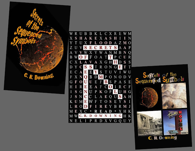
I uncharacteristically deleted most the covers with the original name, Secrets of the Sequenced Symbols. Here are three of the "early editions." 
Left. An example of "it seemed like a good idea at the time." The book begins with a cataclysmic event, but...
Middle. Main characters in the book search for meaning in the sequences of symbols inside books. Look carefully and you'll see seismic terms highlighted in kind of a mauve color.
Right. Just too much. The Traveler's HOT L sign is a hint of some of the next Author blog post.

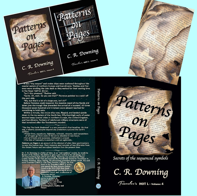
After the name change to Patterns on Pages, there were fewer candidates. The full cover on the bottom is the cover as printed in CreastSpace and Kindle.
Upper left were the two finalists for the front cover.  It was close, but the majority of the critique group liked the burned pages better than the lib'ry shelves. Although both are predictors of plot points, the consensus was that the burned pages were more mysterious. Upper right is the original burned pages photo.
We'll revisit this cover in the final blog of this pair of posts.

Next: AuthorsClosing the Cover
Follow me on Twitter: @CRDowningAuthor and Facebook: https://www.facebook.com/CRDowningAuthor

Monday, January 8, 2018

#History #Anthropology Where I live was once under the San Diego Bay! Part 1


 This is the story of a discovery I made. While not earth-shattering, what I found is significant. I encourage you to imagine as you read through this. You can read what I imagined next Tuesday in Part 2 of this series. 

This is a picture of part of the bank behind my house. If you look carefully, you can see clay peeking out of the leaf litter in the center of the photo. To give you some perspective,
The fountain in the lower right corner is 3-feet tall.
There used to be a pond where the fountain is. While digging the hole, I came across this

It's a collection of clay, sandstone, bone fragments, cut bones, eggshells, and charcoal. Try your hand at labeling the numbered artifacts. The cut bone ends and the charcoal indicate humans were at the site, most probably cooking dinner!


The bank containing the artifacts when the I dug the pond.
The bank continues beyond the back fence. It crests between 40-50 feet above my house.

All the above is evidence that my yard was a tidal flat at some time--several hundred years ago. Over the centuries, silt covered the tidal flat. Some geologic uplift or a drop in sea level exposed the bank. 

So what?

Let's go back to the first photo and walk closer to the bank.


Left to Right: Top Row. Clay layer at the upper right corner. Shells in layer visible in the middle right.
Left to Right: Second Row.  A clearer view of a layer in the bank. Close up of the photo directly above it.
I think it's cool that I found evidence of the people we know as Kumeyaay in my yard.

I gave the artifacts to the fourth-grade teachers. California History is part of the grade 4 curriculum. I wrote a story as a scenario for context for the artifacts.

"On the Estuary" is the name of the story. But, that's for next week.


SEO: nostalgia, Native Americans, family, Kumeyaay, anthropology

Follow me on 
Twitter: @CRDowningAuthor

My website is: www.crdowning.com

My Blogs
Life as I see itTopics rotate between those of general interest to lovers of life,  authors, teachers—probably you, too.  Posts on Tuesdays and some Mondays.  http://crdowning-author.blogspot.com/?alt=rss

My Christian Context. Posts M/W of discussion questions. Thursdays - Timeless Truths. Fridays - Expressions of Faith. https://mychristiancontext.blogspot.com/  

I'd appreciate your feedback on Blogger!

Tuesday, January 2, 2018

Authors: REPRISE Why do you write? My answer.

THIS IS THE LAST OF MY HOLIDAY REPRISE POSTS ON WRITING AND TANGENTIAL TOPICS. 


Authors: Why do you write? My answer.

On January 5, 2017, I saw the movie, “Hidden Figures.” It’s a great movie. I encourage you to see it. People were applauding during the film and there was a standing ovation by many in the audience at the end.
What does seeing a movie have to do with why authors write?

I’m glad you asked.

When watching a movie, one tends to forget the process that spawned that audio-visual experience. At least that’s what the producers hope it does!

That was my experience while watching “Hidden Figures.”
It was after the movie ended that two thoughts struck me.
        1.   Someone wrote that script.
        2.   I’ll bet it’s based on a book.

Both book writing and script writing are forms of writing. While there are similarities, there are significant differences between those types of media.
Scriptwriters focus on dialog. They include some stage direction and set design, but they rely heavily on the directors and actors to provide setting, pace, and tone.
Book writers have to create their entire world inside the mind of a reader. Hopefully, not just one reader but many, many readers. That type of writing requires more written detail in setting, pace, and tone of the story.

It is safe to assume that most writers of a published story of any kind would like to have a lot of people read it . . . after buying it!
The five reasons for writing I provide below are not in a conscious order of importance to me. They are in the order I thought of them.

One reason I write is financial. I’d like to make some money.
I’d like to make at least enough money to cover my expenses of writing, editing, promoting, and publishing every story.
Another reason I write is that I like to writeTo be honest, this is the number one reason. There’s something about engaging in the process of developing a story around characters that become real to me—and hopefully to my readers—that is highly motivational.

A third reason I write is the therapeutic value of the writing process.
Writing allows me to express ideas and complain. I don’t do this often, but when I do, I feel relieved of a burden. When I’m writing fiction, not a single character has ever done anything I didn’t want her/him to do. I never wrote a student off. In fact, I never had a lot of discipline issues when I taught. I know that this reason I write is something that helped me hone my ability to focus on the good of teaching and deflect the “outside influences” that are ever-present in that field.

Fourth reason: I also do reflective writing. While I’ve listed it as a separate reason, the therapeutic value of reflection to me cannot be overstated. I feel strongly about that difference. I find myself remembering valuable lessons when I am engaged in the reflective process.
The two areas I reflect upon with regularity are my teaching career and my faith in God. I have four continuing blog post categories.
       1.   The focus of A Science Guy’s Almanac is my teaching career. I reflect on the incredible good fortune I’ve had in working with the best colleagues and students I can imagine—and I’ve got a good imagination.
       2.   The Timeless Truths series is a reprise and restructuring of over twenty years of sermon notes I have. I am awestruck by the insight into Scripture that I’ve been allowed to experience.
       3.   Expressions of Faith is my personal reflection on a verse or a few verses of Scripture. These short homilies are formulated in my devotions.
       4.   A Day in the Life of a Science Fiction Writer concentrates on the writing process. This post is in this category and is a combination of reflection and the next reason.

The fifth reason I write is to inform. I suppose this post qualifies for inclusion in this reason. I hope you, Reader, find some tidbit of information you can bite into and savor. I lump many topics into this category: writing tips, teaching tips, science concepts are the front-runners. Although there is overlap with other reasons, I’m lumping all my science-teaching products here, too.

I’m stopping at five reasons. There are other reasons that I write. They are hard for me to describe in a way that conveys my definition to my satisfaction.

Without a transition of any type, other than this sentence informing you, Reader, that I’m not including a formal transition, I’m going to keep my promise of closing the loop on the reference to the movie, “Hidden Figures.” [BTW: My Hemingway app marked this a “very hard to read” sentence. That’s true. I blame that on the lack of transition.]

As I stood with the others in the audience watching the credits of “Hidden Figures,” I wondered
        ·      if the author of the book was aware of the influence of the book on American society.
        ·      how the now-deceased characters portrayed in the film might feel about the story of their struggle finally being given a voice.

It was then that I realized the fundamental reason I love reading and writing stories.
Good writing moves minds and hearts.
 Write on.


Follow me on Twitter: @CRDowningAuthor and Facebook: https://www.facebook.com/CRDowningAuthor
My website is: www.crdowning.com

I'd appreciate your feedback as a comment on Blogger!